
 So, did you know that the first week in October is ‘International wallpaper week’? Of course you did!
Wallpaper week is not surprisingly all about promoting wallpapers and bringing it to people’s attention – as well as highlighting the ongoing trend to create a feature wall – that trend’ll never die down will it? I hope not. And that brings me nicely onto the brand new range of papers by wallpaper giant Graham and Brown and their colour of the year which launched today.
Seeing the five new collections for 2019, you’ll not be surprised to see some Japanese influences, Scandi touches, embellishments, geometrical elements and a whole lot of colour. Paula Taylor, Colour & Trend Specialist at Graham & Brown talked through the collections.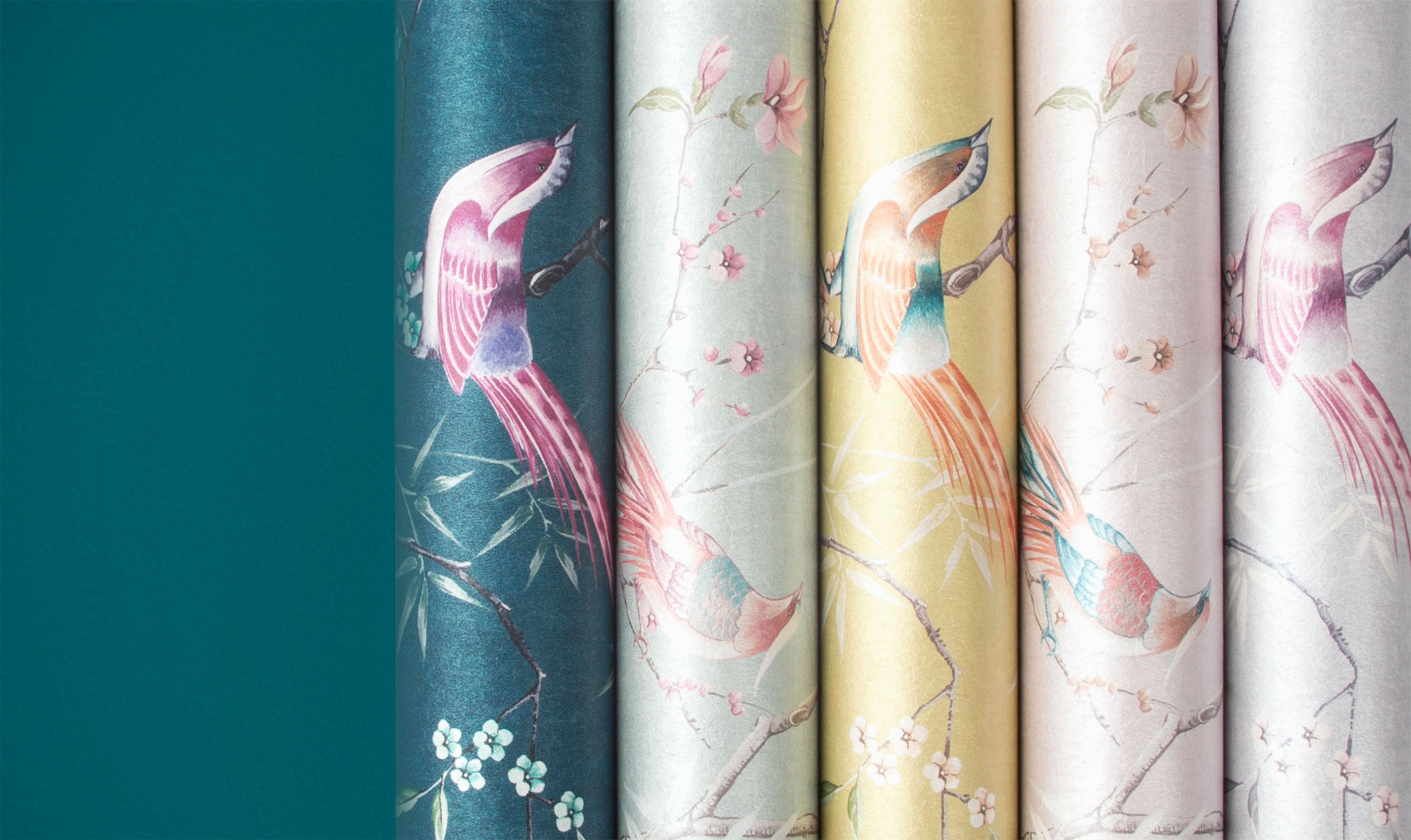
The inspiration for this latest collection is taken from around the world but mainly from Graham and Brown’s 30,000 sample archive dating back to the start of the company in 1946 by Harold Graham and Henry Brown. It’s now the leading wallpaper manufacturer in the UK which isn’t surprising when you see the extensive ranges that they do.
 Wallpaper of the year
Unveiling the wallpaper of the year Paula said ‘We have identified Kabuki as a key design influence for 2019 and the Wallpaper and Colour of the Year 2019. With a rich ancient history, entwining spiritual meanings and diverse mix of inspired imagery, Kabuki-inspired this glamourous paper and colour that transform traditional art into a modern style statement.’
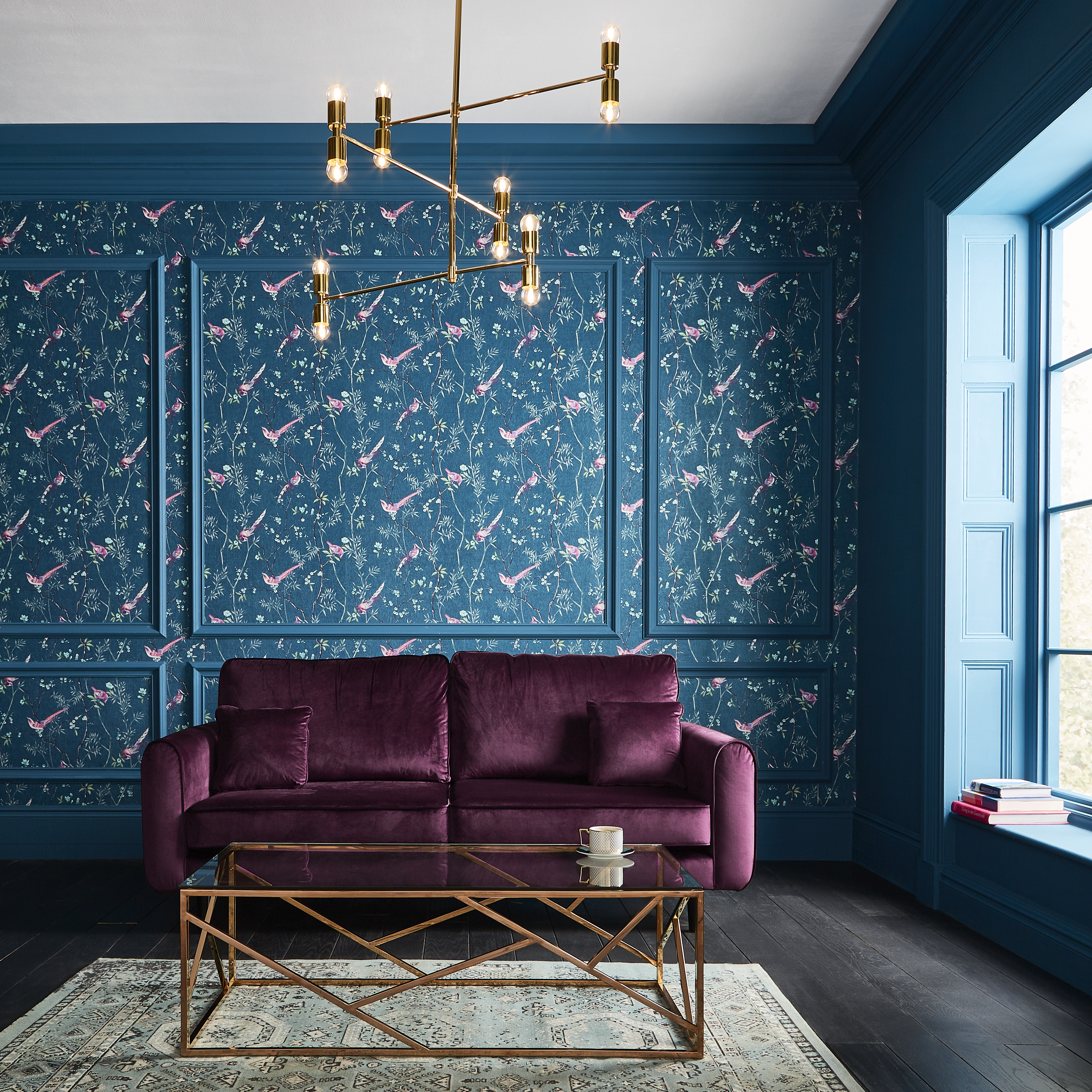
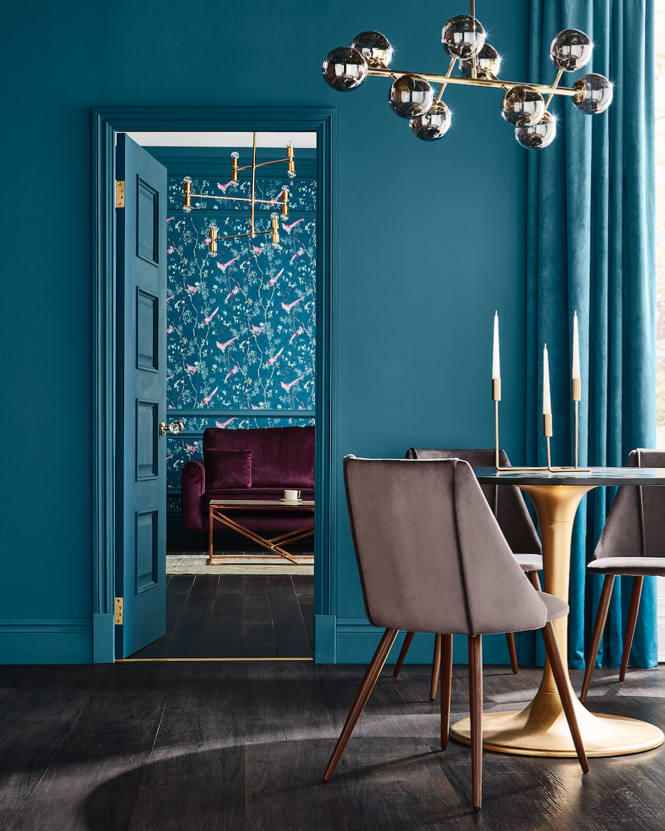
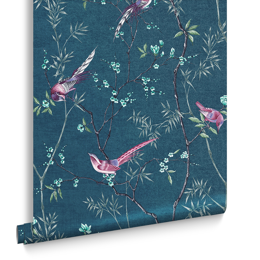
“Hooray for teal” I say! What a stunning deep colour. The wallpaper – ‘Tori’ which comes in Teal (as well as blue, purple, white and bright pink) is a soft to the touch paper with vibrant birds with an Eastern feel. Tori is based on a Chinoiserie bird trail with spring blossoms and I love it.
And the paint…
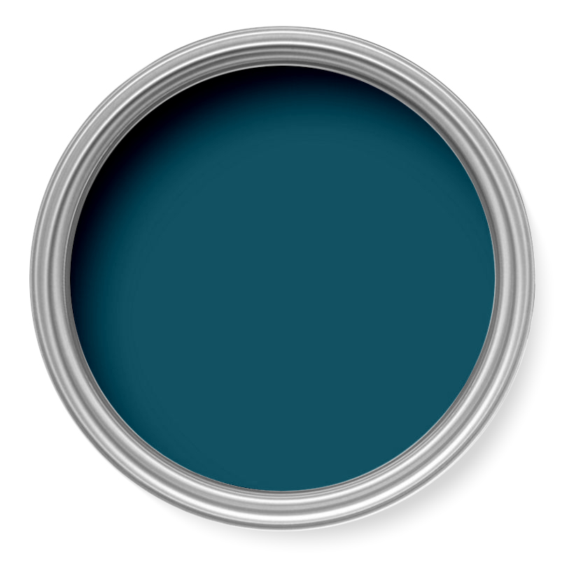
Of course, you can’t have a wallpaper like Tori without an accompanying – and perfectly matching paint. ‘Tiru’ is the exact colour teal that the wallpaper is for a seamless blend in a home.
The new collections in a nutshell
Kabuki (From which Tori has been taken)
With it’s Japanese influence mixed with 1970’s flamboyance this collection with exotic birds takes inspiration from the Japanese tradition of making 1000 origami cranes for a wedding. These paper birds are a symbol of hope and healing and are said to grant the maker to one wish. I hope it’s a big wish after all that folding!
Transformation.
This range is based on world cultures and how they collide.It’s handcrafted look evokes a warm, cosy vibe with lots of reds
Lagom
Meaning just enough. As you would imagine this is a clean living and cosy vibe. Soft geometrics with a very Scandi look. Crisp and clean and minimalist. No fuss.
Hybrid
In the words of Paula this collection is “weird and wonderful”. Lots of ‘Funky foliage’ with a mash-up of Rousseau style designs mixed in with strange animals. It’s Super nature.
Lifecycle
Reinventing. Recycle. Which has a chromotherapy vibe. Pigmented swirl around. Iridescence is a strong feature in this collections with a touch more geometric
So, what do you think of the Graham and Brown Wallpaper and colour of the year? I’d love to know.

Leave a Reply
You must be logged in to post a comment.